
Happy Monday, creative family, and welcome to Logiaweb Weekly.
This week’s design intelligence briefing reveals:
🧪 What I'm Building: Sunday Reset + Full Pipeline
🤖 Design Inspiration: App design in the blink of an eye
🛠️ Tutorial of the Week: Spying on your competitors with Similarweb
💡 Prompt of the Week: Elegant animated hero graphics
🧪 What I'm Building: Sunday Reset + Full Pipeline
Took Sunday completely offline. Back to work Monday with a clear head and full energy.
Can I hit $50K in December? That's the goal.
Right now my pipeline is the fullest it's ever been. The leads are there qualified prospects with real budgets. Instagram is converting, referrals are coming in.
The math works: I need 5-7 solid projects at $8-12K each.
What needs to change:
Follow up faster on opportunities
Close with more confidence
Stop talking to people who aren't ready
Two wins this week: Wrapped a brand project (client loved it, now wants the website) and landed a prospect who needs a complete content system.
December is 40 days away. Pipeline is full, demand is there. Now it's just execution.

🚨Big News: Figma Integrates with [Gemini 3 Pro]
Figma added Gemini 3 Pro to Figma Make this week and it's officially out of beta. Instead of another more AI features to ignore this actually changes how we use and interact with Figma.
What I see:
You can prompt multiple screen flows with real navigation logic. Blank artboards are a thing of the past.
First Gemini 3 Pro interprets what you mean, and then Gemini 3 Image Pro and Nano Banana Pro generate all needed visuals. Boom, just like that you get both structure and style in one pass.
When you feel stuck choosing layouts or polishing, this has your back.

Why you should care
Most of us hit the same wall. We know what a good site should do but translating it to actual screens can be guesswork. That gap just got a bit smaller.
No messing with template packs or stock components. Just describe the flow, refine the output and move on to what actually matters: strategy and brand alignment.
A sunny day for designers
For those of us who understand structure and want high converting layouts this means lightning fast first drafts. And even if you don’t need it, you have three free iterations without ever touching a file.
Don’t get me wrong, this isn't about replacing your design skills. But AI can handle the grunt work so you can focus on actually moving the needle.

🤖 Design Inspiration: App design in the blink of an eye
Tool Used: Gemini 3 Pro with generative UI
Generate a three screen mobile furniture shopping interface on a soft beige to green gradient background. Each iPhone frame should use rounded corners, subtle shadows, and balanced negative space. The left screen shows a centered headline Make every corner feel special in clean black type, a small gray subheading, and a large green accent chair photo on a soft gradient backdrop. Overlay a rounded card in the upper left of the chair with the label Livingroom, the product name Stylish Accent Chair, two small green dots, and a price of 320 dollars. Add a dark green Get Started button at the bottom. The middle screen includes a 9:41 status bar, a circular menu button, pill shaped category filters, and a green promotional card with a First Time Buyer Deal label and a 40 percent off tag. Below it, recreate the product grid with chair thumbnails, clean pricing, and light beige cards. The right screen features a full bleed luxurious living room photo with warm lighting, a rounded bottom card containing the product name Elara Footstool Boucle Natural, a short description, a price of 340 dollars, a five star rating with a circular avatar, and a dark green Buy Now button. Maintain all spacing, shadows, colors, and typographic weights exactly as shown.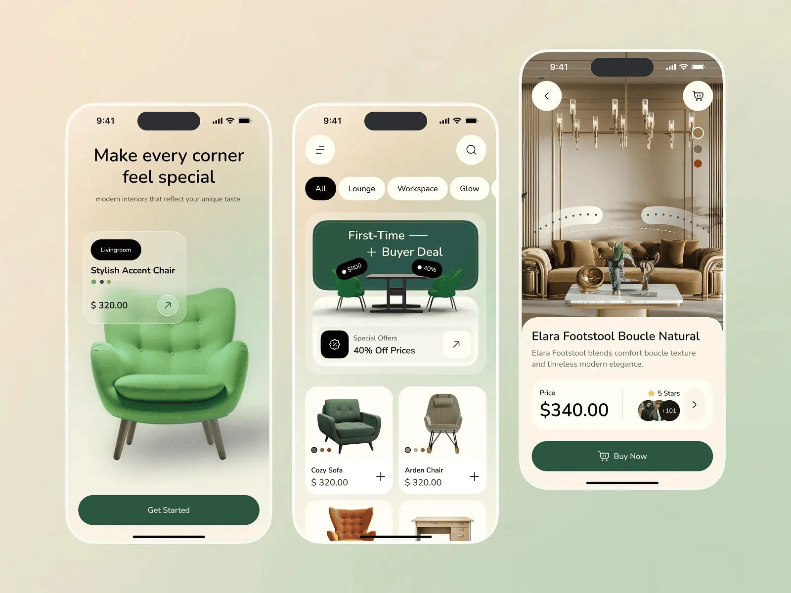
Tool Used: Figma Design AI
Recreate a two screen mobile finance app with a dark background and smooth neon gradients. On the left screen, show a tall rounded rectangle containing three floating credit cards stacked diagonally in perspective, each with soft glassy transparency and a blue to purple gradient glow behind them. Place bold white text at the bottom reading Keep your money moving with you, and add a small horizontal swipe indicator plus a circular button with a purple to blue arrow icon. On the right screen, use a dark rounded container and place a profile photo with the greeting Hi, Alice. Show My Balance above a bold balance of seven thousand six hundred fifty eight dollars fifty cents, with an income and outcome row of two rounded buttons. Below it, include a glowing gradient credit card with white numbers and subtle shadows. Add an Activities section with small circular avatars for Recent Transfers and a purple add button. Use clean white type, tight spacing, smooth shadows, and the same gradient tones throughout.
Tool Used: Adobe Firefly
Recreate a high fidelity mobile food delivery app layout with three adjacent iPhone screens on a soft light gray background. Each screen should use white rounded card containers, gentle outer shadows, and balanced spacing. The left screen shows a 9:41 status bar, a small header with a circular profile photo and the label New York, USA, followed by a rounded light gray search bar with a magnifying glass icon and a settings icon. Below it, include a horizontal row of circular food categories and a pasta promo banner with a dark overlay and an orange 27 percent extra discount label. Add a grilled chicken card with a 35 percent off badge and a heart icon, plus a five icon bottom navigation bar with one orange highlight. The middle and right screens must match the original noodles photography, badges, pricing, size selectors, and text placement with the same warm lighting, steam texture, and clean sans serif type.
🛠️ Tutorial of the Week: Spying on your competitors with Similarweb
If you're not tracking what your competitors are doing you're already behind. Let me show you how to reverse engineer their entire traffic strategy in under 10 minutes.
Step 1: Pull Their Numbers
Go to SimilarWeb and drop a competitor URL.
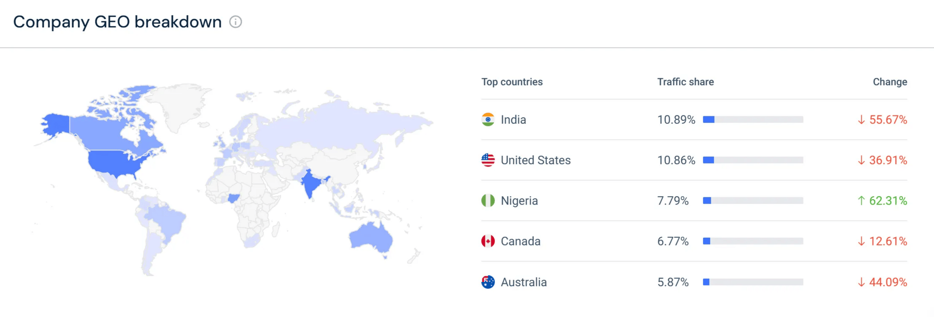
You'll see their monthly traffic, trends and top geographic sources.
It's basically like looking at their Google Analytics without needing access.

Step 2: Compare Side by Side
Add two or three more competitors or your own site.
You should be able to see exactly where you're winning and where you're losing ground.
Instead of guesswork, you get data you can actually act on.

This is where it gets good:
Scroll to the traffic sources breakdown.
Look at what’s driving the most visits for each competitor.
I found a competitor getting 85 to 95% of their traffic from a single channel I wasn't even using. That's a 50K+ visitor opportunity I totally missed.
Step 4: Optimize for AI Search
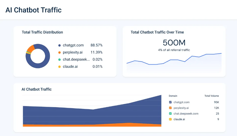
Use the Gen AI feature to track traffic coming from AI tools like ChatGPT and Perplexity.
It shows you popular prompts people are using to find content like yours.
Use that to optimize your site and content so you rank higher in AI search results.
Make sure you act on data. If three competitors are crushing it on YouTube and you're ignoring video, you know your next move. If they're ranking for prompts you're not optimized for, adjust your content strategy.
💡 Prompt of the week: Elegant animated hero graphics
Graphic Tool Used: Runway Gen 4 Alpha

Create a cinematic shot of a sleek black private jet flying above soft sunrise clouds, captured in clean, high contrast lighting. Show the aircraft from a mid close side angle, with the fuselage reflecting warm sky tones and the carbon fiber texture visible along the body. Keep the horizon low and the sky gradient subtle, shifting from pale gold to cool blue. The camera should orbit smoothly around the jet in a controlled arc, moving from the side toward the front while the aircraft continues flying forward at a steady pace. Maintain natural parallax in the clouds and gentle atmospheric haze around the wings. The motion should feel stable, elegant, and weighty, with no sudden acceleration. Keep the title Experience the new Dawn centered above the aircraft in crisp black type, matching spacing and alignment from the reference frame.Wrapping Up
That’s it for this week, but I want to make each edition even better.
👉Got 30 seconds?
Fill out this quick survey and tell me what you'd love to see next. Your feedback directly shapes the next drop.
💌Know a designer who should be using AI smarter?
Forward them this email. Or just send them to logiaweb.com/weekly to join.
See you next Monday,
— Adrien

Adrien Ninet
