Happy Monday, creative family, and welcome to Logiaweb Weekly.
This week’s design intelligence briefing reveals:
🧪 What I'm Building: Behind the Scenes
🤖 Design Inspiration: Proposal designs that close deals (without manual building)
🛠️ Tutorial of the Week: Discovery call to signed proposal at lightspeed
💡 Prompt of the Week: Interactive visualized hero section in Framer

WHAT I’M BUILDING
Behind the Scenes
This week felt different, in a good way. We’re currently in discussions with bigger clients, and the biggest change I’ve noticed is the quality of the calls. Fewer unqualified leads, but way better conversations. The kind where both sides are aligned from the start.
That shift freed up a lot of mental space. I’ve been able to focus more on creating high-quality content, instead of jumping from call to call. And honestly, that’s where I do my best work.
We’re also deep into preparing the next YouTube video, where I’ll break down how to design and build a complete landing page - fully optimized for real business outcomes, whether that’s more sales, more emails collected, or more qualified leads.
Momentum is building, and the direction feels clearer than ever.


BIG NEWS
Disney just handed over the keys to Star Wars, Pixar, and Marvel for use in Sora. This isn't just another partnership it's a complete shift that changes how we think about AI and creative work.

What just happened:
Disney went all in. They're licensing their most valuable IP for user-generated video content in Sora and ChatGPT Images.
Think Spotify finally making peace with music labels, but for visual content. The floodgates just opened for legitimate licensed creativity at scale.
Selected clips will even stream on Disney+. That's not a test they're betting the future on AI.
Why this matters for AI designers
One of the biggest IP holders just shifted from "protect at all costs" to "structure and embrace." For us, that means working with real characters, real brands, and real licensing frameworks instead of generic knockoffs that look "off brand."
Your clients are about to start asking: "Can we do something like this with Sora?" and "How do we blend licensed content into our campaigns?"
If you're not paying attention to AI tooling and rights, you're already behind.
What this means for your workflow
This isn't about making cool Star Wars clips for fun (though you definitely can). This marks the designer's role evolving from "make it look good" to "create brand experiences that blend AI tools, creative vision, and rights management."
Agencies and solo designers who figure out how to position around this will be the ones brands call when Disney-level opportunities come up.

What the future holds
If you understand pacing, framing, brand storytelling, and technical workflows, you won't just be ahead you'll be irreplaceable. Thats why Im urging everyone reading this to learn Sora, understand licensing basics, and think beyond just visual aesthetics

DESIGN INSPIRATION
Proposal designs that close deals (without manual building)
Tool Used: Proposify

PROMPT: A single-page, ultra-clean digital creative proposal designed as one cohesive image.

Editorial, Swiss-inspired layout with generous white space, soft rounded cards, and subtle elevation. Modern minimalist aesthetic similar to high-end design portfolios and premium SaaS branding.

Typography:
Large, elegant headline typography (modern grotesk / sans-serif), bold but refined. Clear typographic hierarchy with oversized section titles, medium subheadings, and light body copy. Crisp black and dark gray text on warm off-white background.

Color palette:
Predominantly monochrome (white, off-white, soft gray, charcoal) with one restrained accent color (muted coral / warm orange) used sparingly for emphasis or icons. No harsh saturation.

Layout structure:
– Top hero section with a confident headline like “From generic to iconic” or “Let’s elevate your brand”
– Short supporting paragraph beneath the headline
– Small profile block in the corner (circular portrait placeholder, name, title: “Digital Creative Expert”)

– Middle section split into clean cards:
• “What I bring to the table” with minimal line icons
• Bullet points for: Strategic brand development, Results-driven creative solutions, Collaborative approach

Each card uses a simple, minimal icon and short, thoughtful copy.

– Bottom CTA section:
“Ready to make something iconic?” with a subtle divider and contact link.

Visual style:
Soft shadows, subtle gradients, smooth rounded corners, calm premium feel. No loud effects. No busy backgrounds. Everything feels intentional, balanced, and editorial.

Composition:
Entire proposal fits into one tall, vertical canvas. Perfectly aligned grid system. Feels like a polished keynote slide meets a luxury brand proposal.Tool Used: joist.ai
As expected, Figma’s own AI isn’t bad at this at all, and could spit out a very decent app quite quickly:

PROMPT: Bold, minimalist, single-page project proposal design built around extreme typographic hierarchy and high contrast.

Background:
Deep matte black background with subtle grain or soft noise texture. No gradients. Pure, confident black canvas.

Typography-led design:
Oversized, all-caps headline typography dominating the top portion of the layout:
“PROJECT PROPOSAL”

Typeface is a modern grotesk or neo-grotesk sans serif (Swiss / editorial inspired). Tight tracking, strong weight, razor-sharp edges. Headline spans nearly the full width of the canvas.

Supporting text:
Smaller white text aligned cleanly beneath or beside the headline:
“Brand & webdesign project proposal for [client name]”

Strong left alignment. Clean vertical rhythm. Clear grid.

Color palette:
– Pure black background
– White typography
– Subtle off-white / light gray for secondary text
– No accent colors (or at most one ultra-subtle neutral gray)

Layout structure:
– Massive typographic hero section
– Large areas of intentional negative space
– Minimalist footer information blocksTool Used: Doco

PROMPT: A clean, professional single-page project proposal designed as a modern AI SaaS interface, using a light off-white background with soft gradients, rounded corners, and subtle shadows; the layout features a centered application window with the headline “Generate proposals” and a small purple-to-pink “AI Powered” badge, a large input field reading “Brand & webdesign project proposal for [client name],” minimal action buttons (Paste link, Add a file, Write job info), a compact tone-control slider panel, and a large output preview area with copy and download buttons, finished with a purple gradient “Upgrade” button, understated designer and client details in the footer, modern sans-serif typography with clear hierarchy, and an overall calm, premium, startup-ready aesthetic.
TUTORIAL OF THE WEEK
Discovery call to signed proposal at lightspeed
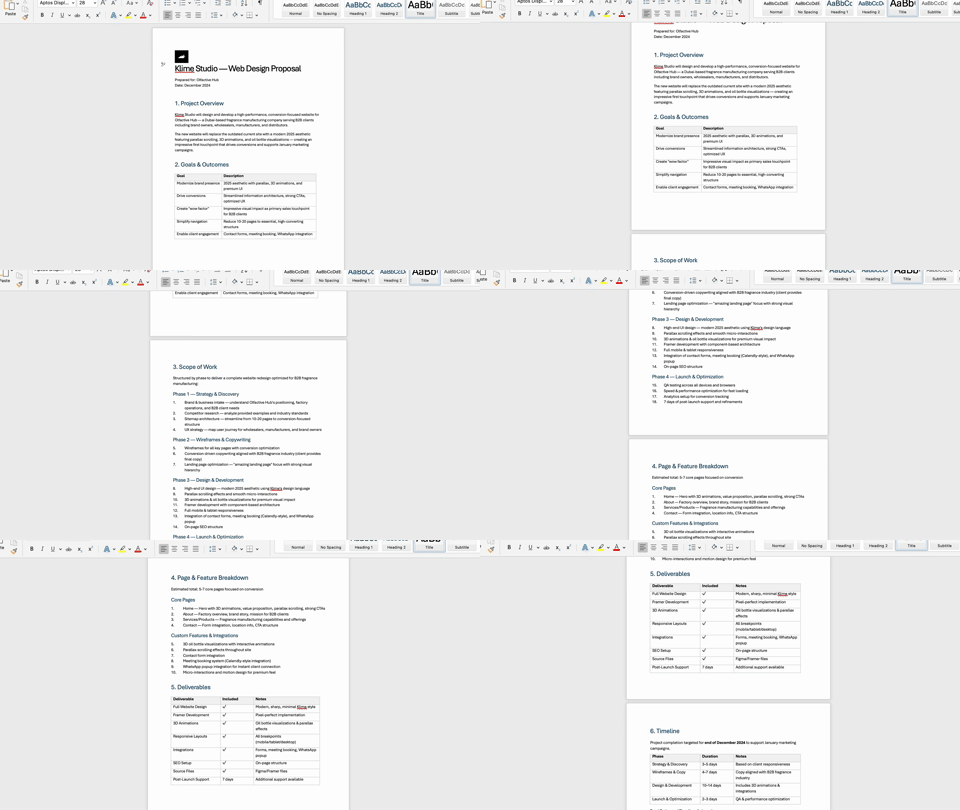
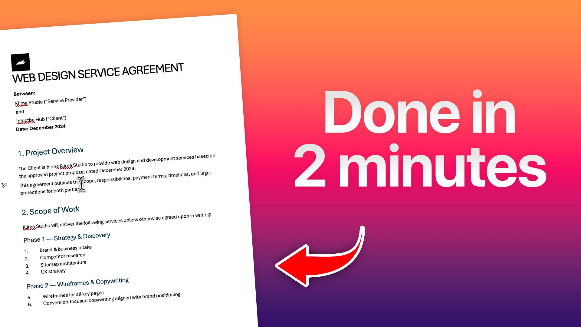
Most designers waste hours writing proposals and contracts. Here's how I do it in 2 minutes flat.
Step 1: Install Doco AI for free
Head to Doco AI and grab the First Word AI Agent.
This is the engine that turns messy notes into polished proposals.

Step 2: Upload your templates and notes
Open Doco and upload your mission proposal templates, ideal client profiles, and any other materials you use.
These become your foundation. The AI pulls from them so everything stays on brand.

Step 3: Record your discovery call
Use a tool like Granola to record and transcribe your client conversation in real time.
You can also use Zoom transcripts or just paste manual notes. Whatever works.
The key is capturing what the client actually said, not what you think they meant.
Don’t skip corners. The better your notes, the better your proposals.

Step 4: Paste notes into Doco and run the workflow
Copy your meeting notes and paste them into Doco.
Run the Web Design Proposal workflow.
In a few seconds, the AI builds the full proposal with structure, scope, timeline and pricing already dialed in.

Step 5: Auto generate the contract
Tag your contract template inside Doco.
The AI automatically generates the full contract based on the proposal details.
No copying and pasting. No missing line items. It's all there.

Step 6: Make quick adjustments and send
Download both docs as PDFs or Word files.
Make any final tweaks if needed.
Send them to your client.
Approximately 0 hours of writing, formatting, and double checking with this workflow.
If you're tired of slow proposal turnarounds or losing deals because you took too long to follow up, try Doco AI here.


PROMPT OF THE WEEK
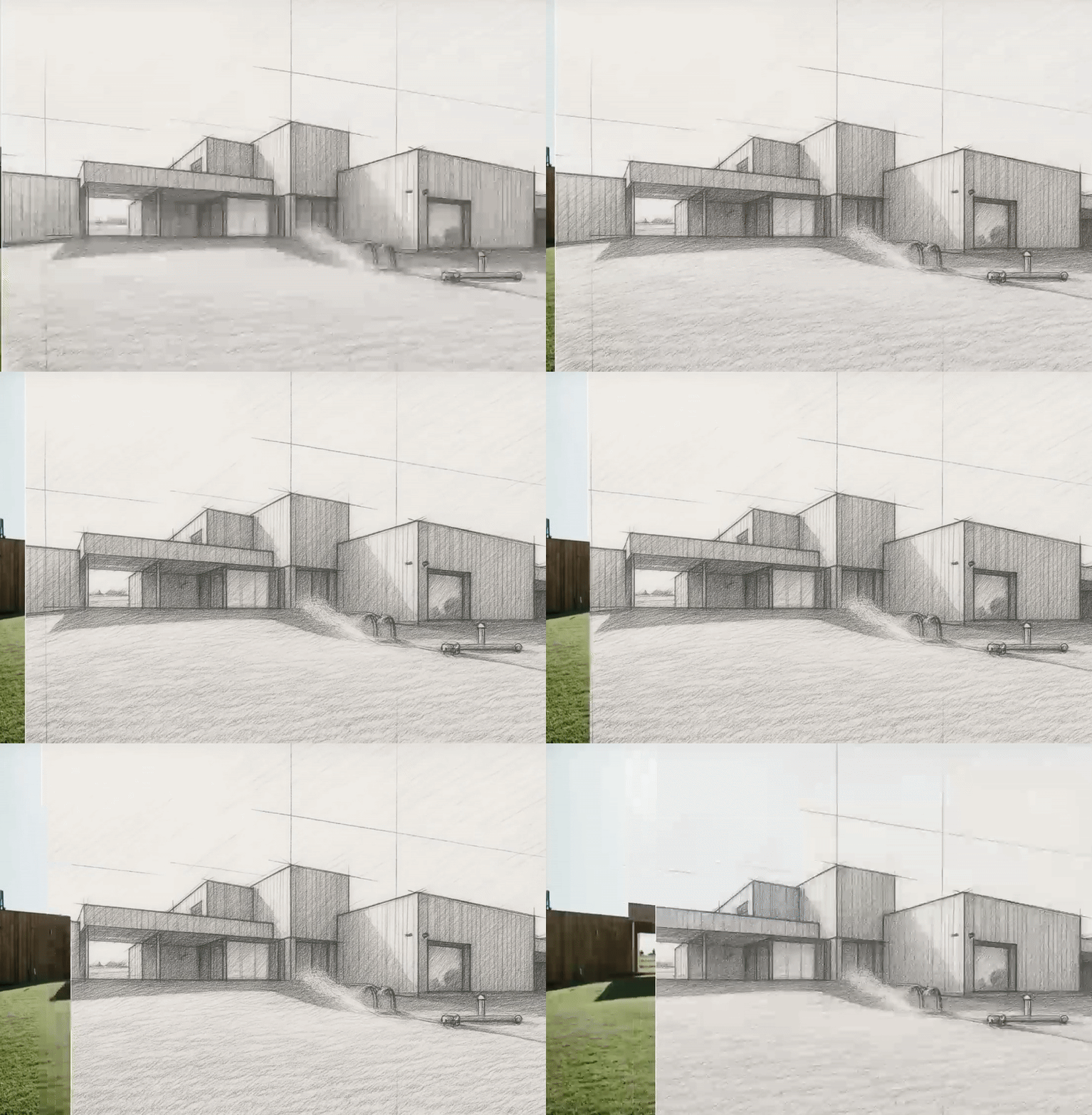
Interactive visualized hero section in Framer

PROMPT: Create a full width hero section with an interactive before and after image slider centered on the page. Use two images of the same scene. The left side should display a realistic architectural photo of a modern house on a green lawn. The right side should display a hand drawn sketch version of that same house. Add a draggable vertical slider handle that follows the cursor and reveals one image over the other as the user moves left or right. Keep the background clean and minimal, with no extra text or buttons layered on top of the slider. Make the hero height large and immersive, with smooth animation on drag and a clear dividing line between the two states.
That’s it for this week, but I want to make each edition even better.
👉 Got 30 seconds?
Fill out this quick survey and tell me what you'd love to see next. Your feedback directly shapes the next drop.
💌 Know a designer who should be using AI smarter?
Forward them this email. Or just send them to logiaweb.com/weekly to join.
See you next Monday,
— Adrien


Adrien Ninet

