Happy Monday, creative family, and welcome to Logiaweb Weekly.
This week’s design intelligence briefing reveals:
🧪 What I'm Building: Behind the Scenes
🚨 Big News: NVIDIA just made AI video effects feel instant
🤖 Design Inspiration: App design layouts using AI tools
🛠️ Tutorial of the Week: Build a custom design review tool in 10 minutes
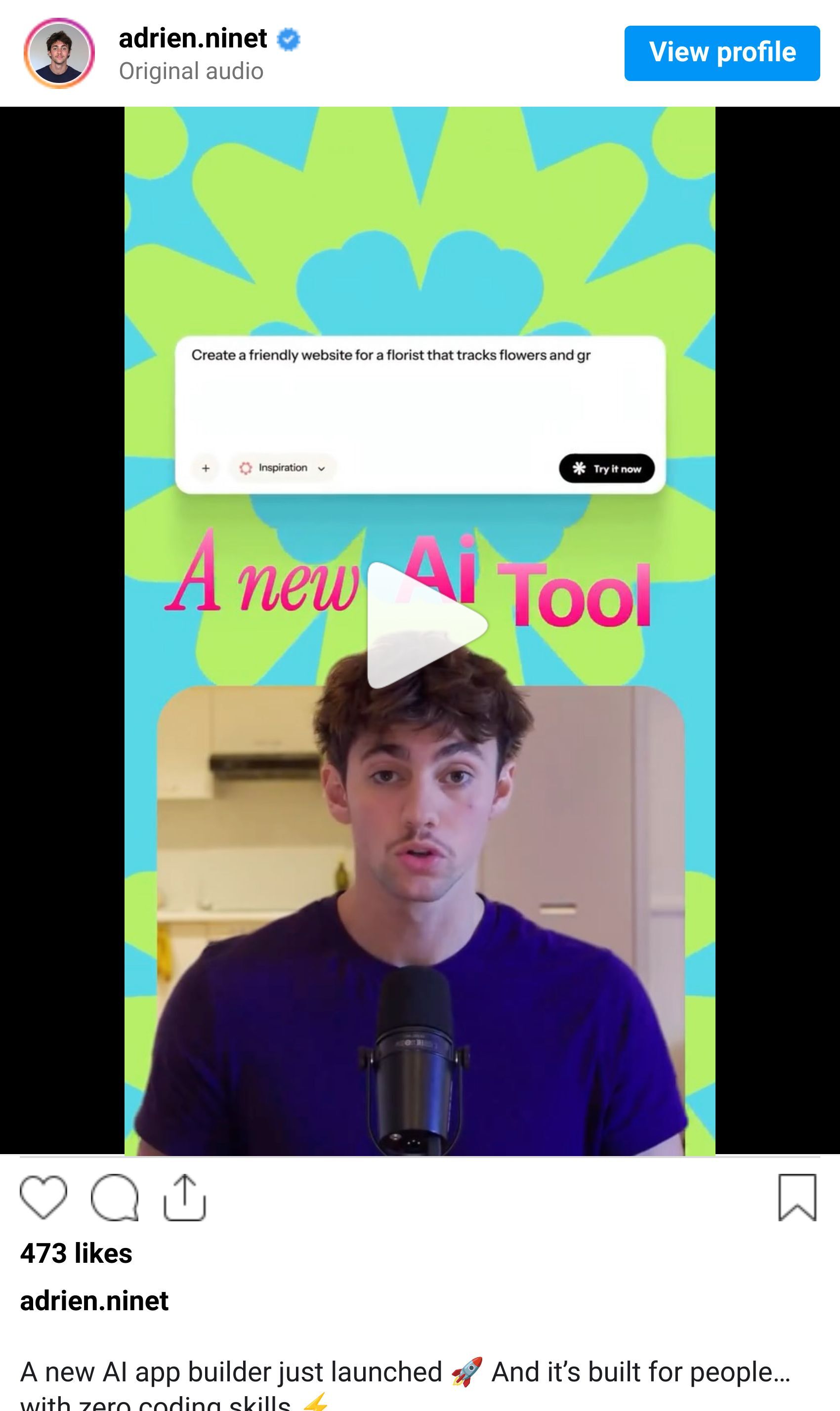
💡 Prompt of the Week: Build an app without writing a single line of code with MOCHA
⚙️ Tool of the Week: MOCHA

WHAT I’M BUILDING
Behind the Scenes
This week, I was in Dubai for the 1 Billion Followers Summit. One of the biggest conferences in the world for content creators, with speakers like MrBeast and many other top creators.
I also had the chance to step on stage and give a talk on how to build a startup using AI tools. It was my very first time speaking in front of a large audience. I won’t lie, I was stressed right before going on. But the moment I started talking, everything disappeared. And honestly? I loved it.
Beyond the stage, I met incredible people, learned a ton, and enjoyed discovering Dubai for the first time. I also connected with a lot of business owners and founders, which made the whole experience even more valuable.
This was a first, but definitely not the last.

BIG NEWS
NVIDIA dropped something at CES 2026 that most people missed. But if you're doing anything with AI videos, this changes your entire workflow.
What caught my attention:
They upgraded their diffusion tooling and added a new video relighting feature that's not just a little faster, it's about 3× faster. And it works on lower-end GPUs now.
The best part? The relighting actually looks natural and stable. There is no more flickering or weird artifacts.
If you're doing product promos, motion snippets, or quick concepting for clients, this is huge.

Why it matters
Speed is creativity. Your ideas die when your tools start to lag.
NVIDIA has just reduced that friction. What used to take minutes now happens almost instantly. That means more iterations and faster approvals.

The real win
Most of us are bouncing between tools just to get decent lighting on AI generated videos. Manual color grading. Render times. With this update, you might be able to skip all that and standardize a lighting pass right in your NVIDIA Broadcast or RTX workflow.
NVIDIA isn't just optimizing code. They're removing the annoying parts of the creative process so you can focus on what actually matters.
This could be the update that makes AI video tools feel less like beta software and more like actual production gear.
If you're already using NVIDIA workflows, retest your lighting pipeline this week. You might be sitting on a shortcut you didn't know existed.
DESIGN INSPIRATION
App design layouts using AI tools
Tool Used: UX Pilot

PROMPT: Design a modern AI-powered SaaS website that helps users understand and explore complex systems through visual explanations and conversational insights, using a dark, premium, and minimal aesthetic with a strong marketing-first layout rather than a code editor, featuring a top navigation with Docs, Pricing, and Sign in, a homepage-style dashboard with a clear hero message and primary “Connect” call-to-action, card-based sections that summarize insights and explanations in plain language, visual panels that reference files or concepts without showing raw code, an embedded AI assistant panel styled like a product feature rather than a developer chat, clean typography (sans-serif only), generous spacing, rounded cards, subtle gradients, soft shadows, and a refined electric blue or teal accent on a near-black background, desktop-first, polished, and designed to feel like a professional website product page rather than an IDE or terminal interface.Tool Used: Rocket.new

PROMPT: Create a modern, high-end SaaS landing page for a developer-focused product with a clean white background and strong visual hierarchy, featuring a centered hero section with a large, bold headline that spans multiple lines, a concise supporting subheadline explaining the value proposition, subtle trust indicators near the headline (small avatars, usage stats, or credibility text), a single primary call-to-action button with rounded corners, and minimal secondary metadata below the hero, followed by a structured feature overview section using evenly spaced cards or columns with simple icons, short titles, and brief descriptions, using modern sans-serif typography, generous spacing, soft shadows, subtle borders, neutral colors with one warm accent, a polished top navigation with product links and a search or utility area, and an overall feel that is precise, professional, and design-system driven, optimized for clarity, credibility, and conversion rather than visual noise.
symmetry, no illustration or stylized beauty aesthetic.Tool Used: Readdy AI

PROMPT: Create a single, elegant homepage hero section for a curated digital tools platform, with a modern, editorial, design-forward aesthetic, featuring a bold yet refined headline, a short and confident subheadline, one clear primary call-to-action, no stock imagery, a clean layout driven by typography and spacing, subtle gradients or soft abstract backgrounds, rounded elements, restrained motion or hover accents, a neutral color palette with one sophisticated accent color, and an overall feel that is calm, premium, and trustworthy, like the opening section of a thoughtfully curated product directory rather than a sales-focused landing page.TUTORIAL OF THE WEEK
Build a custom design review tool in 10 minutes
Here's the exact process I used to create a working design review app from scratch.
Step 1: Find Your Design Inspiration
Browse the web and find a site with a design system you love.
Copy the full URL of that website.
Open Claude and paste the link in.

Step 2: Extract the Design System
Write this exact prompt: "Extract the entire design system, which I can then use to build my own app."
Claude pulls out the entire system automatically. No guesswork, no manual work.
Copy the output. You now have a complete design foundation ready to use.
Pro Tip: This works with any site. If you see good design, you can reverse engineer it in seconds.

Step 3: Build the App in Emergent
A few minutes later, your first version is live. No code. No templates. Just a working app.

Step 4: Test and Fix
Click through the app and test the flow.
If something feels off, just describe the fix in plain language.
The AI adjusts it instantly. Done.

Step 5: Deploy It
Once it looks right, click Deploy.
Your app is now live and ready to use.


What used to require a developer, a budget, and weeks of work now happens in one focused session.
You can build tools like this to replace subscriptions, speed up your workflow, or even launch your own product and charge for it.
If you're tired of paying for tools that don't quite fit your process, try Emergent.
PROMPT OF THE WEEK

PROMPT: Create a clean, modern Linktree-style landing page mockup for a digital creator with a soft pastel background and a bold, playful aesthetic. Center the layout vertically with a circular illustrated avatar at the top, followed by the creator’s name in a clean sans-serif font and a short subtitle like “Digital Creator & Lifestyle Influencer,” plus a small highlighted username tag beneath it. Design a stack of large, rounded rectangular buttons with thick black outlines, each in a different vibrant color (red, green, blue, purple, yellow), labeled for content links such as YouTube, podcast, merch, fitness program, and newsletter, each featuring a subtle external-link icon on the right. Use generous spacing, strong contrast, and a slightly retro UI feel with crisp edges and minimal shadows. Add a row of simple monochrome social media icons near the bottom and a small copyright footer. The overall look should feel friendly, creator-focused, mobile-first, and visually bold while remaining clean and easy to scan.professional — prioritizing personality over perfection.TOOL OF THE WEEK
Most app builders still assume you know something about code, databases, or logic. Mocha doesn’t. This one is built for designers, creatives, and solo founders who just want an app live asap.
👉 Here’s a demo for building an app in Mocha.
🧠 How I'd use it
I’d use Mocha for:
MVPs for client ideas
Internal tools (dashboards, trackers, micro-SaaS concepts)
Rapid prototypes to validate ideas before spending weeks designing
Designers who want to ship functionality without becoming backend engineers
This is especially powerful if you already understand UX/UI but hate backend complexity.
💡 Bonus Prompt
Set this up as a complete app.

Include:
- Simple CMS-style content editing
- Lightweight backend for images and text
- Clean data structure
- SEO-friendly pages and OG images
- One-click publish with custom domain support

Keep everything minimal and easy to update.That’s it for this week, but I want to make each edition even better.
👉 Got 30 seconds?
Fill out this quick survey and tell me what you'd love to see next. Your feedback directly shapes the next drop.
💌 Know a designer who should be using AI smarter?
Forward them this email. Or just send them to logiaweb.com/weekly to join.
See you next Monday,
— Adrien


Adrien Ninet
