Happy Monday, creative family, and welcome to Logiaweb Weekly.
This week’s design intelligence briefing reveals:
🧪 What I'm Building: Behind the Scenes
🚨 Big News: Anthropic Just Dropped Claude Opus 4.6 & Designers Should Pay Attention
🤖 Design Inspiration: Quality AI Website Landing Pages
🛠️ Tutorial of the Week: Build an AI Powered Website in Under 5 Minutes with Runable
💡 Prompt of the Week: Quality Website Design Bolt
⚙️ AI Tool of the Week: Remotion

WHAT I’M BUILDING
Behind the Scenes
This week, I had the chance to collaborate on a video with Cursor. That pushed me to spend more time exploring the platform, especially its integration powered by Claude Code. And honestly… it’s insane.
If you have strong product design skills today, you can literally build almost anything. The barrier between design and development keeps shrinking.
So in my free time, I’ve been experimenting - building small SaaS ideas just to test what’s possible. It really feels like this is the best time ever to be a designer.
That’s why this week’s AI deep
dive will focus on Claude Code Opus 4.6 and why it’s quietly changing the entire vibe-coding landscape.


BIG NEWS
Anthropic Just Dropped Claude Opus 4.6 & Designers Should Pay Attention
Microsoft just dropped Trellis 2, an open source AI model that turns any image into a high quality 3D asset. And the best part? It's completely free.
What caught my attention
This is not just another 3D tool. Trellis 2 is a model that generates fully textured 3D models with real materials. We're talking base color, roughness, metallic properties, and even transparency. All from a single image.
Upload a photo, hit generate, and within seconds you get a preview. If it looks good, click one button and your 3D model is ready to download. At 512 resolution, it takes about 3 seconds. At 1536 resolution, about 60 seconds.

Why it matters
If you've tried using AI to code a website before, you know that it forgets your earlier instructions. It breaks something it already built. It loses context after a few messages. That happens significantly less now.
The extended context means you can paste your full brand guide, your copy, your design tokens, and your sitemap into one conversation and Claude keeps it all consistent from header to footer.
For designers who don't code, this closes the gap even further. You describe what you want in plain English, and the AI outputs production-ready code that you can ship with fully working HTML, CSS, and JavaScript. And with Figma MCP, you can skip the plain English entirely — connect your Figma designs directly to Claude and it reads your layers, spacing, and color values to generate code that's almost pixel-perfect to your original mockup. No more eyeballing padding or guessing hex codes.
On performance benchmarks, Opus 4.6 outperforms every other AI model on economically valuable work tasks. It's also better at understanding what you're asking for.

The real win
Opus 4.6 also integrates directly into PowerPoint now. It reads your layout, fonts, and slide masters to keep everything on brand. That alone saves hours when building client presentations.
But the bigger shift is what this means for daily workflow. AI is no longer just a helpful assistant, you can now consider it a partner who you can discuss with, reason with and take opinions and advice from. The combination of better planning, longer focus, and parallel agents means you can hand off entire website builds and get results that actually look like an experienced designer was involved.

DESIGN INSPIRATION
Quality AI Website Landing Pages
Tool Used: UX Pilot

PROMPT: Design a modern SaaS website landing page for a project management platform with a clean, premium dark navy background. Center a hero section with a bold white headline spanning two lines, a concise gray subheadline explaining the core value proposition, and a bright blue primary call to action button with rounded corners and a subtle glow effect on hover. Below the hero, float a large product screenshot inside a browser mockup frame with a soft shadow and slight upward tilt for depth. Add a trusted by section with five minimalist grayscale company logos in a horizontal row with generous spacing. Further down, create a three column feature grid using rounded card containers with subtle glass borders, simple line icons in blue, short feature titles in white, and brief descriptions in muted gray. Use a modern geometric sans serif typeface throughout with generous line height and letter spacing. Keep the overall design precise, professional, and conversion focused with zero decorative noise. Strong visual hierarchy and clear content blocks separated by ample whitespace. Footer with four column link layout and a centered copyright line.Tool Used: Readdy AI

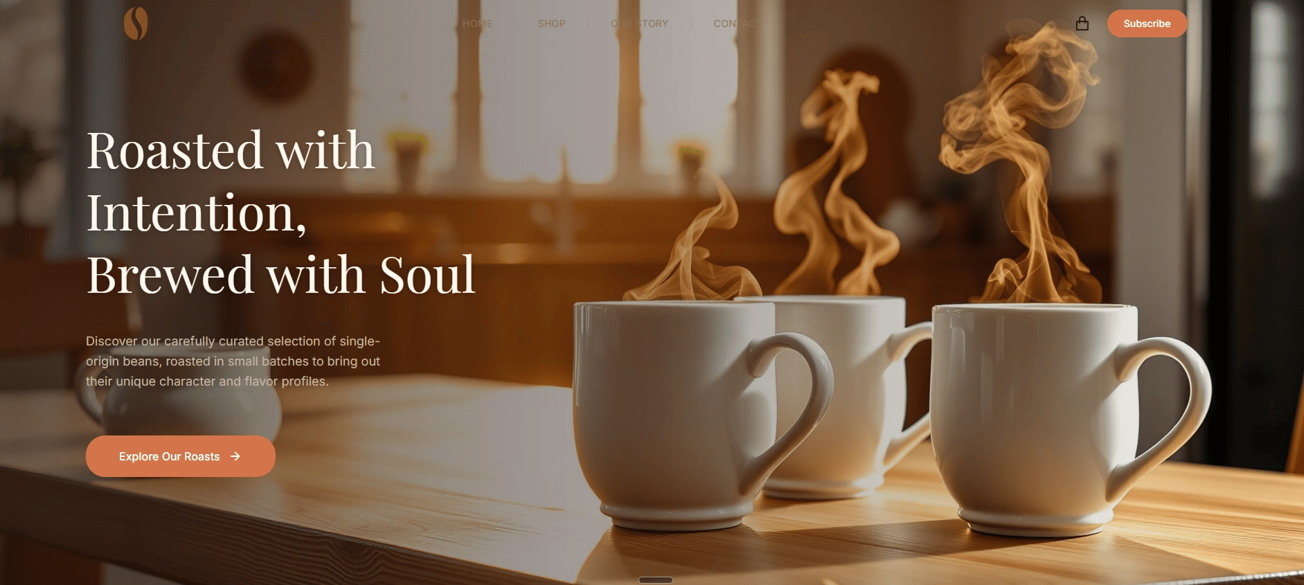
PROMPT: Design a premium ecommerce landing page for a specialty coffee roaster with a warm editorial aesthetic. Use a rich cream background with a full width hero section featuring a large lifestyle photograph of a steaming ceramic cup on a wooden surface with soft natural light from the left side. Overlay a bold serif headline in dark espresso brown with a supporting subheadline in warm gray beneath it. Add a rounded call to action button in burnt orange with white text. Below the hero, include a product showcase section with three coffee bags displayed on clean white cards with soft drop shadows, each showing the blend name in serif type, origin details in small sans serif text, a tasting notes line, and a price badge. Add a brand story section with a two column layout, short paragraph on the left and a close up roasting photograph on the right. Use warm earth tones throughout, terracotta, cream, deep brown, with a single accent in burnt orange. The overall feel should be artisanal, warm, and trustworthy like a boutique coffee shop site designed for a Dribbble portfolio.Tool Used: Rocket

PROMPT: Design a luxury fashion brand landing page with bold high contrast editorial styling. Use a pure black background with a dramatic full screen hero featuring a large black and white fashion photograph positioned off center to the right third of the page. On the left, place a large uppercase sans serif headline in thin white type with extreme letter spacing. Add a small understated call to action link in white with a thin underline beneath the headline. Below the hero, create a two column lookbook section with alternating large and small images in a masonry style grid, each image in muted desaturated tones with generous black padding between them. Include a minimal navigation bar with the brand name in small caps on the left and four text links on the right. Typography should be ultra clean using a single geometric sans serif family across the entire page. No rounded corners, no gradients, no decorative elements. Footer with brand name centered in small caps, four navigation links, and a copyright line. The page should feel like a Vogue editorial adapted for web, minimal, confident, and intentionally restrained.
TUTORIAL OF THE WEEK
Build an AI Powered Website in Under 5 Minutes with Runable
With this workflow you can go from custom background to live site in minutes.

Step 1: Generate a custom background Image
Go to Runable and open the AI image generator.
Write a detailed prompt for the background visual you want. Think about mood, colors, and composition that match your brand or concept.
Generate the image and download it.
Pro Tip: Be specific with your prompt. Instead of "abstract background," describe the exact color palette, texture, and visual energy you're going for. Detail produces better output every time.

Step 2: Animate your background
Take your generated image and use Runable’s image to video tools.
Apply subtle effects through prompting like soft zooms, or floating particle overlays.
This gives your site instant depth and visual energy without any video editing software.
The animation is what will separate your page from a flat page that doesn't hold attention.

Step 3: Build the hero section with AI
Open [Runable’s][runable.com] AI website builder.
Describe the hero section you want in plain language. Something like "clean hero section with bold headline, subheadline, and call to action button layered over my animated background."
The AI generates a fully structured hero section around your visual.

Step 4: Customize and refine
Adjust typography, spacing, and colors to match your vision.
Tweak the layout. Move elements, resize sections, update copy.
Preview the page to make sure everything works.

Step 5: Publish and go live
Once your page looks polished, hit Publish.
Your website is now live.

You can do background generation, animation, layout building, and publishing all in one place. You do not need to worry about context switching between five different tools.
If you need a landing page for a concept, a quick client pitch, or a portfolio piece, this gets you there faster than anything else out there.

PROMPT OF THE WEEK
Quality Website Design Bolt

PROMPT: Build a modern portfolio website for a creative design studio with a light off white background and bold typographic hierarchy. The homepage should feature an oversized sans serif headline in dark charcoal that spans the full viewport width, with a single line subheadline beneath it in medium gray and generous letter spacing. On the right two thirds of the hero section, place a large angled image container with a subtle shadow that will hold a featured project image. Add a minimal vertical navigation on the left side with small text labels and a colored dot indicator for the active page in terracotta. Include a floating circular badge in the top right corner displaying the studio founding year. Add a smooth scroll down indicator centered at the bottom edge of the hero. Below the fold, create a two column project grid with large image cards, project titles in bold, and category tags in small caps. Add an about section with a short studio bio on the left and a team photo grid on the right. Include a contact section with a simple form for name, email, and message. Use only two typefaces, one geometric sans serif for headlines and one humanist sans serif for body text. Color palette limited to off white, charcoal, and terracotta used sparingly on interactive elements and hover states. Add smooth fade in animations on scroll for each section. Footer with studio name, social links, and copyright. The entire site should feel editorial, spacious, and intentionally minimal. Fully responsive across all screen sizes.
TOOL OF THE WEEK
Remotion lets you create professional videos entirely from text prompts using code just describe what you want to your AI coding agent (like Claude Code or Cursor), and it generates animated videos with things like 3D maps, data visualizations, product demos, and motion graphics.
👉 Here's a demo of Remotion

🧠How I'd use it
I'd use Remotion to:
Generate short promotional videos for newsletter launches or product announcements without touching After Effects or hiring a video editor.
Create animated data visualizations like bar chart races or timeline animations for social content that actually stops the scroll.
Build transparent call to action overlays and product demo videos for client pitches that look like a production team made them.
💡 Bonus Prompt:
Use this prompt with Remotion + Claude Code to create an animated launch announcement video for a new product or feature.
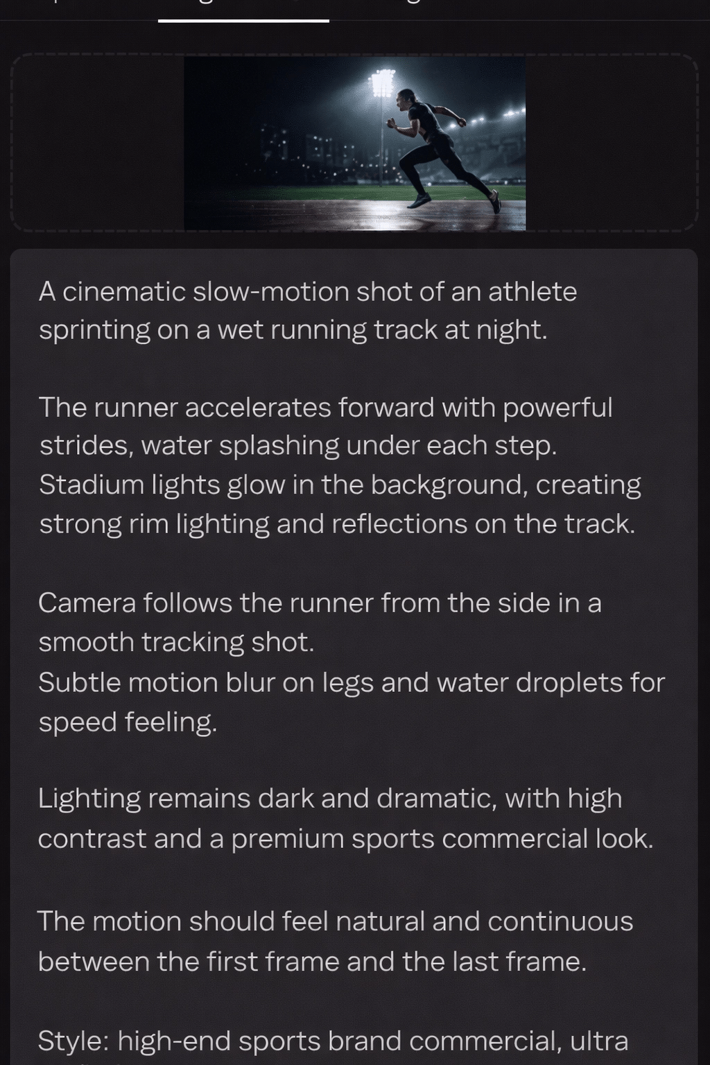
Prompt: Create a 15-second animated launch announcement video for a new AI-powered email marketing tool. Start with a dark gradient background and the product logo fading in with a subtle glow effect. Transition to a quick 3-step feature breakdown: first show an inbox icon with animated emails flowing in, then a brain/AI icon with pulsing neural network lines representing smart segmentation, and finally a chart icon with an animated line graph climbing upward showing revenue growth. Each step should slide in from the right with smooth easing and hold for 3 seconds. End with a bold call-to-action text "Start Free Trial" that scales up with a spring animation, followed by the website URL fading in below. Use a modern color palette with deep navy background, electric blue accents, and white text. Add subtle particle effects in the background throughout. Keep typography clean with a sans-serif font, and ensure all transitions feel smooth and polished with consistent motion design.
That’s it for this week, but I want to make each edition even better.
👉 Got 30 seconds?
Fill out this quick survey and tell me what you'd love to see next. Your feedback directly shapes the next drop.
💌 Know a designer who should be using AI smarter?
Forward them this email. Or just send them to logiaweb.com/weekly to join.
See you next Monday,
— Adrien


Adrien Ninet
