
Give Claude Designer Taste
Nov 2, 2026 · 11 steps
Most websites built with AI look the same. The layout is safe, the animations are generic and the spacing feels slightly off.
This guide fixes that in three moves. First, Claude studies award-winning websites before it designs anything. Then it learns how Apple handles motion and depth. Finally, you refine the result by hand, and Claude builds from your version.
What you need
- Awwwards MCP for design references from award-winning websites. It is free and open source, with no account or API key.
- Emil Kowalski's skills for Apple-style motion and depth. They are free and open source.
- Paper or pen.dev to refine the design by hand on a canvas. Both have a free plan: Paper gives you 100 agent actions per week, and pen.dev gives you 5 days of agent design per month.
- Claude Code to build the website. It needs a paid Claude plan, starting with Pro.
Part 1 - Study award winners first: Awwwards MCP
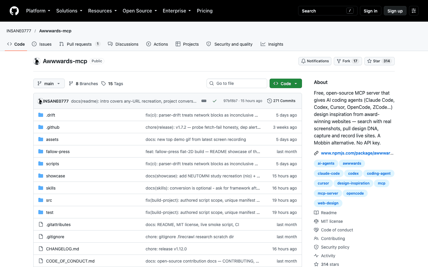
Awwwards is the site where the best websites in the world win awards. The Awwwards MCP lets Claude search those winners, read their design DNA and compare your build against them.
- 1
Step 1
Install the Awwwards MCP
You need Node.js 22.13 or newer. Run
node -vin your terminal to check your version.Then add the MCP to Claude Code with one command.
Terminalclaude mcp add awwwards -- npx -y awwwards-mcp
The live tools, like scoring your build, also need a headless browser. Install it once.
Terminalnpm install -g playwright && npx playwright install chromium
Restart Claude Code after installing, then type
/mcpto check that awwwards shows up as connected. - 2
Step 2
Pull two or three references before Claude designs anything
Do not let Claude start from a blank page. Ask it to find award-winning sites that match the style you want first.
mdUse the Awwwards MCP to find 3 award-winning websites for [type of project, e.g. a portfolio for a product designer]. The style I want: [e.g. minimal, lots of white space, bold serif typography, subtle scroll animations]. For each site, show me the screenshot, the color palette, the fonts and the technologies used. Do not write any code yet.
Pick the references yourself. Claude finds the options, but choosing the direction is the designer's job.
- 3
Step 3
Turn your references into a design brief
Once you have picked your favorites, ask Claude to turn them into a brief. This gives every later prompt a clear target.
mdUse create_design_brief with these sites: [site 1], [site 2]. My project goal: [one sentence on what the website is for and who it is for]. Then build the homepage following that brief. Keep the layout, spacing and typography decisions from the references, but use my content: [paste your content or describe it].
- 4
Step 4
Score your build against the reference
This is the part most people skip. The
verify_buildtool compares your page with the reference site and gives it a score out of 100.It checks how close your page structure is to the reference and how similar the motion feels. It also tells you exactly what is missing.
mdRun verify_build on my homepage against [reference site]. Show me the score out of 100 and list the 3 biggest differences. Then fix those 3 differences and run verify_build again.
Do not chase 100. The goal is to learn from the reference, not to copy it. A score in the 70s with your own content and brand is usually the sweet spot.
Part 2 - Make it feel like Apple: Apple Design skill
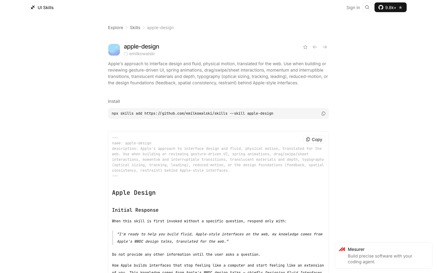
Emil Kowalski is a design engineer known for some of the smoothest interfaces on the web. His apple-design skill teaches Claude how Apple designs, from spring animations to translucent glass and depth, translated for the web.
- 5
Step 5
Install the skill
Run this in your project folder. It installs only the apple-design skill.
Terminalnpx skills add https://github.com/emilkowalski/skills --skill apple-design
The full pack has 15 skills. If you want all of them, run
npx skills@latest add emilkowalski/skillsinstead. The ones I use most after apple-design are review-animations and improve-animations. - 6
Step 6
Ask for springs, not fixed animations
AI tools default to simple fade and slide animations with a fixed duration. Apple uses springs instead, which feel physical and can be interrupted at any moment.
mdUse the apple-design skill. Review every animation on this page and replace fixed-duration transitions with spring animations. Buttons should respond the instant they are pressed. Anything the user can drag, like a menu or a card, should follow the cursor 1:1 and keep its momentum on release.
- 7
Step 7
Add the glass and depth layer
The glass effect is what makes Apple interfaces feel layered. Used on the right elements, it adds depth without adding clutter.
mdUse the apple-design skill. Add translucent glass materials to [the navigation bar / the modal / the floating cards] so the content behind them shows through, blurred. Keep the text perfectly readable on top. Use glass on 2 or 3 elements maximum, not everywhere.
Restraint is the whole trick. Glass on every element looks cheap. Glass on the one element that floats above the content looks premium.
Part 3 - Refine by hand: Paper or pen.dev
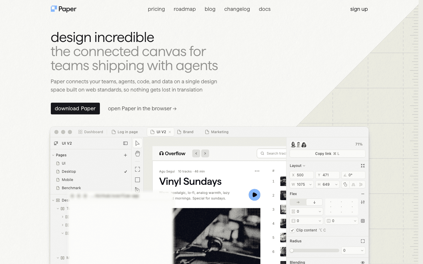
AI gets you most of the way. The last part, the part that makes a website feel like yours, is done by hand.
Paper and pen.dev both give you a real design canvas with a live preview of what Claude built. You fix the details visually, and Claude builds from your version.
- 8
Step 8
Connect Paper to Claude Code
Download Paper Desktop from paper.design and keep it open. Then run this command.
Terminalclaude mcp add paper --transport http http://127.0.0.1:29979/mcp --scope user
Type
Open Paper/mcpin Claude Code to check that Paper is connected. The free plan includes 100 agent actions per week, which is enough to refine a few pages. - 9
Step 9
Or use pen.dev instead
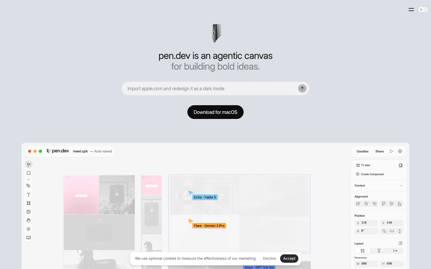
pen.dev, formerly called Pencil. pen.dev, formerly Pencil, is an agentic canvas for macOS. Download the app, then open Settings, go to Agents and choose Claude Code to connect it.
The free plan gives you 5 days per month of designing with an agent, plus 25 image or SVG generations.
Download pen.dev - 10
Step 10
Fix the spacing yourself
Open your page on the canvas and look at it like a designer. Most of the time, the problem is not the colors or the fonts. It is the spacing.
Adjust the padding between sections, align elements to a clear grid and give your headlines more room to breathe. Then tweak anything else that feels off.
Pick one spacing scale, for example 8, 16, 24, 48 and 96 pixels, and only use those values. Consistent spacing is the fastest way to make a page look designed.
- 11
Step 11
Let Claude build from your version
Once you are happy with the canvas, hand it back to Claude so the code matches your design exactly.
mdI refined the design on the canvas in [Paper / pen.dev]. Read the current version of [frame or page name] and update the code so it matches exactly: spacing, alignment, font sizes and colors. Do not change anything I did not change on the canvas. Keep all the spring animations and glass effects from before.
Part 4 - Plan the site before you build it with Stage
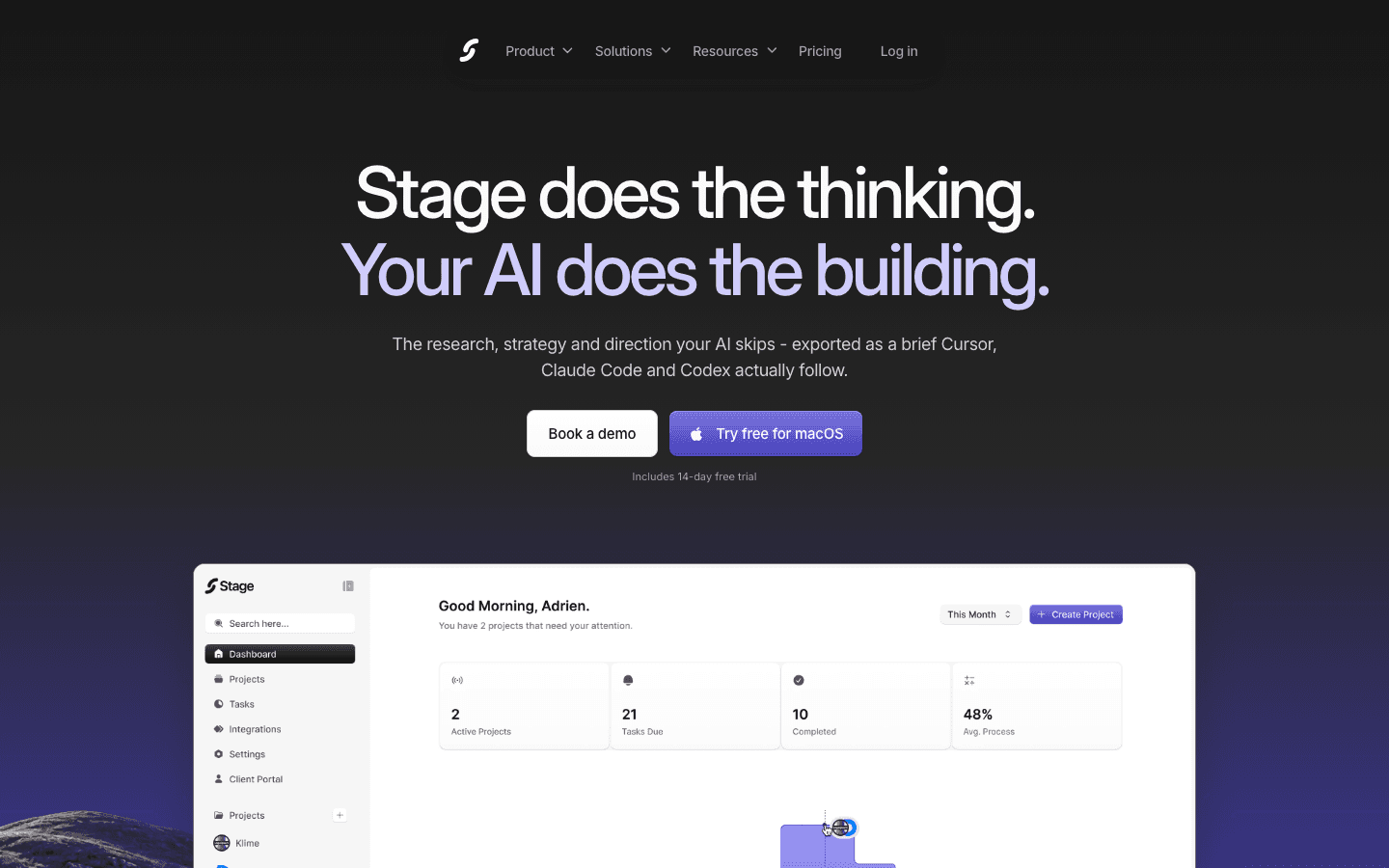
Great references and great motion only work if the website has a clear direction. Stage does the research, strategy and design direction your AI skips, then exports it as a brief that Claude Code actually follows. You start Part 1 already knowing what to build and who it is for.
Tips
- Use one main reference per project, because mixing five different award winners gives you a page with no identity.
- Fix the spacing before you touch the colors, since most AI websites look generated because of uneven spacing, not because of their palette.
- Keep motion for the moments that matter, like a button press, a menu opening or a page loading, and leave everything else still.
- Turn on reduced motion on your phone and check the page, because Apple-style design respects people who turn animations off.